Quick Steps Pipeline
Quick Steps Pipeline as the name suggests is a pretty fast template which can be used on any data science problem to generate a basic pipeline and get some quick and dirty analysis with baseline results. The aim of this pipeline is not to get the best results, but to get a good understanding about the data as quickly as possible and with minimum effort.
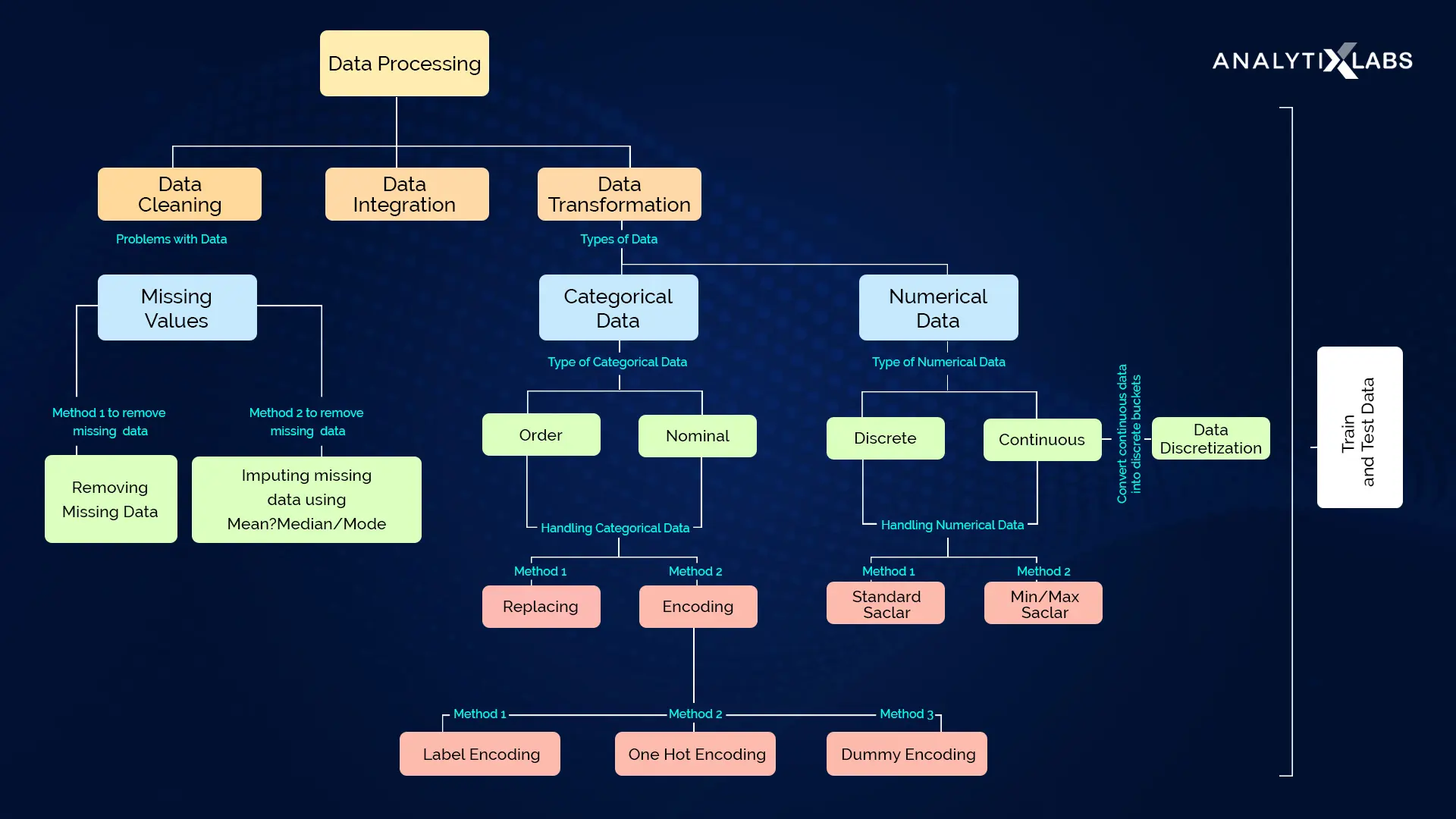
In a data science project data is supreme and hence we will structure our project as the data is structured
According to Data Engineering Principles described in the kedro library, We have divided the complete process into 8 Layers which are given below. Next we will discuss a little bit about each layer and what is supposed to be done in that layer
Data Layer Definitions
├── data
│   ├── 01_raw            <-- Raw immutable data
│   ├── 02_intermediate   <-- Typed data
│   ├── 03_primary        <-- Cleaned Domain model data
│   ├── 04_feature        <-- Model features
│   ├── 05_model_input    <-- Often called 'master tables'
│   ├── 06_models         <-- Serialised models
│   ├── 07_model_output   <-- Data generated by model runs
│   ├── 08_reporting      <-- Ad hoc descriptive cuts
Raw Layer
This is the initial start of the pipeline, contains the sourced data model(s) that should never be changed, it forms your single source of truth to work from. These data models can be un-typed in most cases e.g. csv, but this will vary from case to case. Given the relative cost of storage today, painful experience suggests it's safer to never work with the original data directly!
Understand the Business Requirement.
- Define the Problem Statement
- Define the customer and other stakeholders
- Define regression / classification / other
- Define assessment metrics
Questions & Hypotheses
No matter what first generate questions & hypotheses about your data and the problem at hand.
- Build as many hypotheses as you can about the data !
- What type of variation occurs within my variables?
- What type of co-variation occurs between my variables?
- Which values are the most common? Why?
- Which values are rare? Why? Does that match your expectations?
- Are there any unusual patterns? What might explain them?
- How are the observations within each cluster similar to each other?
- How are the observations in separate clusters different from each other?
- How can you explain or describe the clusters?
- Can the appearance of clusters be misleading? if Yes How could this happen?
- Are there any missing Values or outliers and should you remove these outliers.
- Could a pattern be due to coincidence (i.e. random chance)?
- How can you describe the relationship implied by the pattern?
- How strong is the relationship implied by the pattern?
- What other variables might affect a relationship?
- Does the relationship change if you look at individual subgroups of the data?
Intermediate Layer
This stage is optional if your data is already typed. Typed representation of the raw layer e.g. converting string based values into their current typed representation as numbers, dates etc. Our recommended approach is to mirror the raw layer in a typed format like Apache Parquet. Avoid transforming the structure of the data, but simple operations like cleaning up field names or 'unioning' multi-part CSVs is okay.
Basic Cleaning
- Parsing dates & times and type the Data
- Typos in the name of features (UPPER_CASE) , the same attribute with a different name, mislabelled classes, i.e. separate classes that should really be the same, or inconsistent capitalisation.
- Treat data as immutable
Create Schema
We'll look at each variable and do a philosophical analysis about their meaning and importance for this problem.
This is an template example of how a schema yaml file should look
schema:
  raw_data1:
    features:
      col1:
        name: col1
        dtype: str / datetime64 / int16 / int32 / int64 / float16 / float32 / float64
        value_type: numerical_continuous / numerical_discrete / categorical_unordered / categorical_ordered / id / datetime / long_text
        feature_type: target / feature
        attribute_domain: events / location / aggregate / business / time
        influence_expectation: High / Medium / Low
        comments: general comments
      col2:
        name: col2
        dtype: str / datetime64 / int16 / int32 / int64 / float16 / float32 / float64
        value_type: numerical_continuous / numerical_discrete / categorical_unordered / categorical_ordered / id / datetime / long_text
        feature_type: target / feature
        attribute_domain: events / location / aggregate / business / time
        influence_expectation: High / Medium / Low
        comments: general comments
    primary_keys:
      - col1
      - col2
Exploratory Analysis
- EDA Block
- Slice and Dice
- Generate Data Drift for all features or at least the target
- Count, Quantiles, Mean, Std, Median, Mode, Skewness, Kurtosis / Peakedness, Min, Max
- QQ-Plots, Deviation from normal distribution
- Pandas Profiling / DataPrep Report
- Pandera
Primary Layer
Domain specific data model(s) containing cleansed, transformed and wrangled data from either raw or intermediate, which forms your layer that can be treated as the workspace for any feature engineering down the line. This holds the data transformed into a model that fits the problem domain in question. If you are working with data which is already formatted for the problem domain, it is reasonable to skip to this point.
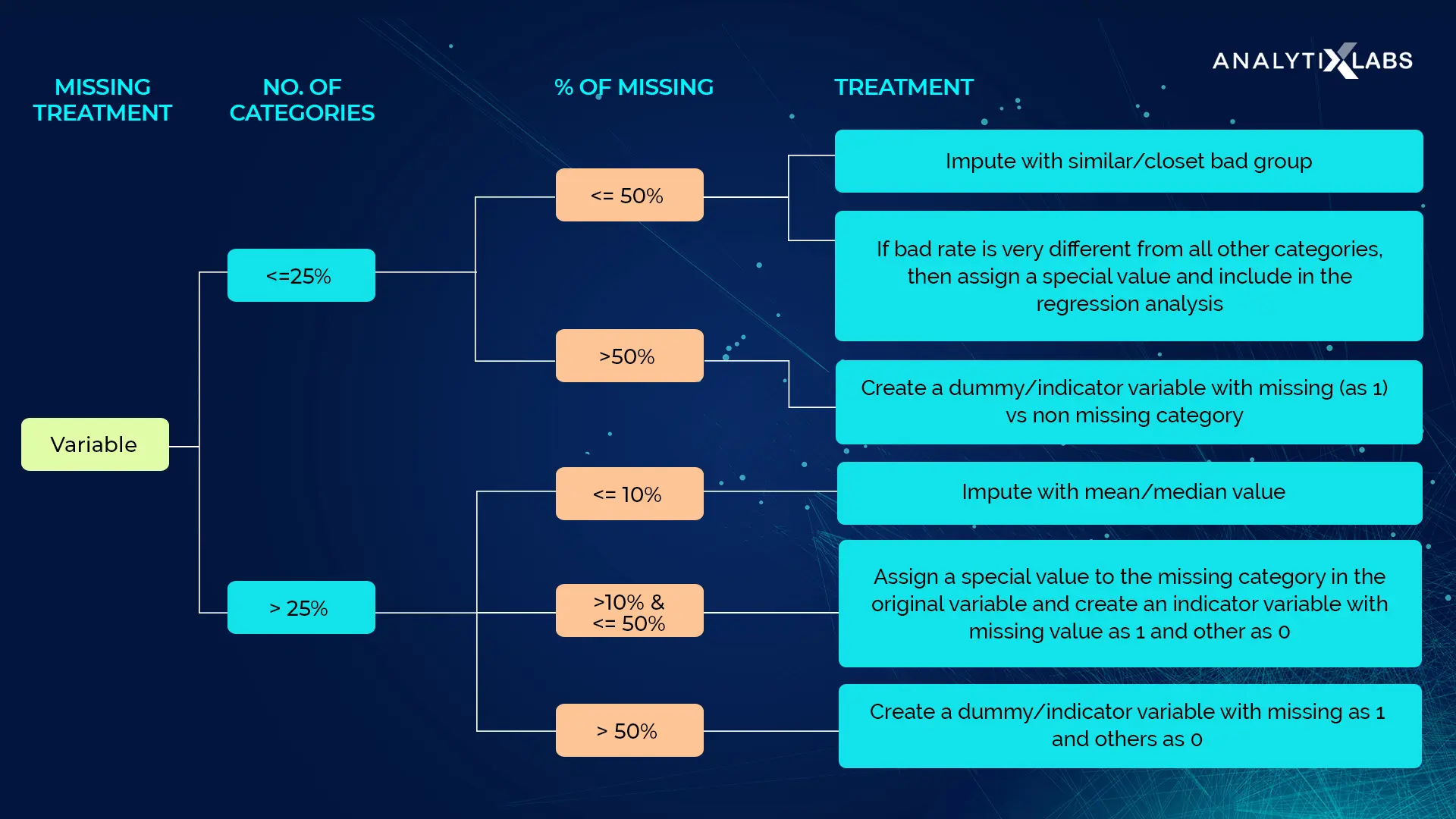
Missing Data Imputation
- How prevalent is the missing data?
- Is missing data random or does it have a pattern?
MeanMedianImputer: replaces missing data in numerical variables by the mean or median
ArbitraryNumberImputer: replaces missing data in numerical variables by an arbitrary number
EndTailImputer: replaces missing data in numerical variables by numbers at the distribution tails
CategoricalImputer: replaces missing data with an arbitrary string or by the most frequent category
RandomSampleImputer: replaces missing data by random sampling observations from the variable
AddMissingIndicator: adds a binary missing indicator to flag observations with missing data
DropMissingData: removes observations (rows) containing missing values from dataframe
Outlier Analysis
- Univariate and Multivariate Analysis
- PyOd , Alibi Detect and EDA Block
- Use Domain Knowledge to decide if you need to remove the outliers
- Treating for negative values, if any present depending on the data
ArbitraryOutlierCapper: caps maximum and minimum values at user defined values
Winsorizer: caps maximum or minimum values using statistical parameters
OutlierTrimmer: removes outliers from the dataset
Feature Layer
Analytics specific data model(s) containing a set of features defined against the primary data, which are grouped by feature area of analysis and stored against a common dimension. In practice this covers the independent variables and target variable which will form the basis for ML exploration and application. 'Feature Stores' provide a versioned, centralised storage location with low-latency serving.
Tips on Creating Features
It's good to keep in mind your model's own strengths and weaknesses when creating features. Here are some guidelines:
- Linear models learn sums and differences naturally, but can't learn anything more complex.
- Ratios seem to be difficult for most models to learn. Ratio combinations often lead to some easy performance gains.
- Linear models and neural nets generally do better with normalized features. Neural nets especially need features scaled to values not too far from 0. Tree-based models (like random forests and XGBoost) can sometimes benefit from normalization, but usually much less so.
- Tree models can learn to approximate almost any combination of features, but when a combination is especially important they can still benefit from having it explicitly created, especially when data is limited.
- Counts are especially helpful for tree models, since these models don't have a natural way of aggregating information across many features at once.
Derived Feature Creation
Math Features
MathFeatures: creates new variables by combining features with mathematical operations
RelativeFeatures: combines variables with reference features
CyclicalFeatures: creates variables using sine and cosine, suitable for cyclical features
Time series Features
DatetimeFeatures: extract features from datetime variables
LagFeatures: extract lag features
WindowFeatures: create window features
ExpandingWindowFeatures: create expanding window features
Events Features
Location - Distance Features
Feature Store : Feast
Register all the Features to a Feature Store like Feast
Features Analysis
- EDA Block
- DataPrep Report
- Spearman's rank correlation coefficient
- Pearson Product-Moment Coefficient
Features Assumptions Test :
According to Hair et al. (2013), four assumptions should be tested:
-
Check Normality:
- Ks Test : Find a distribution for the feature
- QQ Plot : Conform the distribution for the feature
- Box Cox Transforms / Yeo Johnson Transformations (Power Law Transforms)
- When we talk about normality what we mean is that the data should look like a normal distribution. This is important because several statistic tests rely on this (e.g. t-statistics). In this exercise we'll just check univariate normality for Target feature (which is a limited approach). Remember that univariate normality doesn't ensure multivariate normality (which is what we would like to have), but it helps. Another detail to take into account is that in big samples (>200 observations) normality is not such an issue. However, if we solve normality, we avoid a lot of other problems (e.g. heteroscedacity) so that's the main reason why we are doing this analysis.
Negative values and zero value don't allow log transformations so do one of the following
1. Create a binary feature with 0 for 0 values in original feature else 1 Then, proceed transformation on original feature with all the non-zero observations, ignoring those with value zero. 2. Add a small value (1e-10) to all values allowing us to do the transform -
Check Homoscedasticity: > Homoscedasticity refers to the 'assumption that dependent variable(s) exhibit equal levels of variance across the range of predictor variable(s)' (Hair et al., 2013). Homoscedasticity is desirable because we want the error term to be the same across all values of the independent variables.
-
Check Linearity: > The most common way to assess linearity is to examine scatter plots and search for linear patterns. If patterns are not linear, it would be worthwhile to explore data transformations. However, we'll not get into this because most of the scatter plots we've seen appear to have linear relationships.
-
Check Absence of correlated errors: > Correlated errors, like the definition suggests, happen when one error is correlated to another. For instance, if one positive error makes a negative error systematically, it means that there's a relationship between these variables. This occurs often in time series, where some patterns are time related. If you detect something, try to add a variable that can explain the effect you're getting. That's the most common solution for correlated errors.
Model input Layer
Analytics specific data model(s) containing all feature data against a common dimension and in the case of live projects against an analytics run date to ensure that you track the historical changes of the features over time. Many places call these the 'Master Table(s)', we believe this terminology is more precise and covers multi-models pipelines better.
Feature transformation
Here we replace/transform the original feature with one or more features in order to make all features numerical or remove noise by clustering/ binning. Sometimes features are changed to introduce a Gaussian like feature. Or Create new dimension in feature by specific transforms like Fourier or by aggregation
Categorical encoding
OneHotEncoder: performs one hot encoding, optional: of popular categories
CountFrequencyEncoder: replaces categories by the observation count or percentage
OrdinalEncoder: replaces categories by numbers arbitrarily or ordered by target
MeanEncoder: replaces categories by the target mean
WoEEncoder: replaces categories by the weight of evidence
PRatioEncoder: replaces categories by a ratio of probabilities
DecisionTreeEncoder: replaces categories by predictions of a decision tree
RareLabelEncoder: groups infrequent categories
Discretisation
Cluster Labels as a Feature: Applied to a single real-valued feature, clustering acts like a traditional "binning" or "discretization" transform. Adding a feature of cluster labels can help machine learning models untangle complicated relationships of space or proximity.
ArbitraryDiscretiser: sorts variable into intervals defined by the user
EqualFrequencyDiscretiser: sorts variable into equal frequency intervals
EqualWidthDiscretiser: sorts variable into equal width intervals
DecisionTreeDiscretiser: uses decision trees to create finite variables
Power Transforms
LogTransformer: performs logarithmic transformation of numerical variables
LogCpTransformer: performs logarithmic transformation after adding a constant value
ReciprocalTransformer: performs reciprocal transformation of numerical variables
PowerTransformer: performs power transformation of numerical variables
BoxCoxTransformer: performs Box-Cox transformation of numerical variables
YeoJohnsonTransformer: performs Yeo-Johnson transformation of numerical variables
Fourier Features
Aggregate Features
Generalization
Preprocessing Transformations
- Min-max normalization
- Z-Score normalization
- Decimal scaling normalization
Target Encoding
- A target encoding is any kind of encoding that replaces a feature's categories with some number derived from the target.
- High-cardinality features: A feature with a large number of categories can be troublesome to encode: a one-hot encoding would generate too many features and alternatives, like a label encoding, might not be appropriate for that feature. A target encoding derives numbers for the categories using the feature's most important property: its relationship with the target.
- Domain-motivated features: From prior experience, you might suspect that a categorical feature should be important even if it scored poorly with a feature metric. A target encoding can help reveal a feature's true informativeness.
Feature selection
Feature Utility Metric, a function measuring associations between a feature and the target : Mutual information is a lot like correlation in that it measures a relationship between two quantities. The advantage of mutual information is that it can detect any kind of relationship, while correlation only detects linear relationships. Mutual information describes relationships in terms of uncertainty. The mutual information (MI) between two quantities is a measure of the extent to which knowledge of one quantity reduces uncertainty about the other. If you knew the value of a feature, how much more confident would you be about the target?
DropFeatures: drops an arbitrary subset of variables from a dataframe
DropConstantFeatures: drops constant and quasi-constant variables from a dataframe
DropDuplicateFeatures: drops duplicated variables from a dataframe
DropCorrelatedFeatures: drops correlated variables from a dataframe
SmartCorrelatedSelection: selects best features from correlated groups
DropHighPSIFeatures: selects features based on the Population Stability Index (PSI)
SelectByShuffling: selects features by evaluating model performance after feature shuffling
SelectBySingleFeaturePerformance: selects features based on their performance on univariate estimators
SelectByTargetMeanPerformance: selects features based on target mean encoding performance
RecursiveFeatureElimination: selects features recursively, by evaluating model performance
RecursiveFeatureAddition: selects features recursively, by evaluating model performance
Dimensionality Reduction
- The first way is to use PCA as a descriptive technique. Since the components tell you about the variation, you could compute the MI scores for the components and see what kind of variation is most predictive of your target. That could give you ideas for kinds of features to create -- a product or a ratio of two features. You could even try clustering on one or more of the high-scoring components.
- The second way is to use the components themselves as features. Because the components expose the variational structure of the data directly, they can often be more informative than the original features.
- Dimensionality reduction: When your features are highly redundant (multicollinear, specifically), PCA will partition out the redundancy into one or more near-zero variance components, which you can then drop since they will contain little or no information.
- Anomaly detection: Unusual variation, not apparent from the original features, will often show up in the low-variance components. These components could be highly informative in an anomaly or outlier detection task.
- Noise reduction: A collection of sensor readings will often share some common background noise. PCA can sometimes collect the (informative) signal into a smaller number of features while leaving the noise alone, thus boosting the signal-to-noise ratio.
- Decorrelation: Some ML algorithms struggle with highly-correlated features. PCA transforms correlated features into uncorrelated components, which could be easier for your algorithm to work with.
Models Layer
Stored, serialised pre-trained machine learning models. In the simplest case, these are stored as something like a pickle file on a filesystem. More mature implementations would leverage MLOps frameworks that provide model serving such as MLFlow.
Model Architecture
Model output Layer
Analytics specific data model(s) containing the results generated by the model based on the model input data.
Reporting Layer
Reporting data model(s) that are used to combine a set of primary, feature, model input and model output data used to drive the dashboard and the views constructed. Used for outputting analyses or modelling results that are often Ad Hoc or simply descriptive reports. It encapsulates and removes the need to define any blending or joining of data, improve performance and replacement of presentation layer without having to redefine the data models.
- Analyse Error histograms for each sub section of the data
- To create subsection
- Use low cardinality categorical features as it is
- Convert high cardinality categorical features to the mean/probability of predicted values (regression/classification)
- Bin the real valued features using decision trees
Appendix : Resources
- EDA
- Feature Engine Kaggle
- category-encoders
- practical-code-implementations of FE
- Python Libraries:
- Kedro Layering Principles
- Preprocessing
- EDA dataviz
- MLOPS
Appendix : EDA Block
Univariate study
-
Categorical Features
- catplot : Categorical estimate plots:
- pointplot() (with kind="point")
- barplot() (with kind="bar") (metric=mean)
- countplot() (with kind="count") (metric=count)
- catplot : Categorical estimate plots:
-
Continuous Features
- displot:
- histplot() (with kind="hist")
- kdeplot() (with kind="kde")
- ecdfplot() (with kind="ecdf")
- displot:
Multivariate study
-
Categorical Vs Continuous Features
- catplot : Categorical scatterplots:
- stripplot() (with kind="strip")
- swarmplot() (with kind="swarm")
- catplot : Categorical distribution plots:
- boxplot() (with kind="box")
- violinplot() (with kind="violin")
- boxenplot() (with kind="boxen")
- catplot : Categorical estimate plots:
- pointplot() (with kind="point")
- barplot() (with kind="bar") (metric=mean)
- countplot() (with kind="count") (metric=count)
- catplot : Categorical scatterplots:
-
Continuous Vs Continuous Features
- relplot:
- scatterplot() (with kind="scatter"; the default)
- lineplot() (with kind="line")
- displot:
- histplot() (with kind="hist")
- kdeplot() (with kind="kde")
- Heatmap of Pivot Table
- relplot:
-
Categorical Vs Categorical Features
- catplot: Categorical estimate plots:
- barplot() (with kind="bar") (metric=mean)
- countplot() (with kind="count") (metric=count)
- catplot: Categorical estimate plots:
Unsupervised Study
- K-means Clustering is a clustering method in unsupervised learning where data points are assigned into
- K groups, i.e. the number of clusters, based on the distance from each group’s centroid.
Refine questions & hypotheses
Use what has been learned to refine questions & hypotheses and generate new questions & hypotheses
Why EDA
Enabling EDA
- Suggest hypotheses about the causes of observed phenomena
- Assess assumptions on which statistical inference will be based
- Provide a basis for further data generation and collection through surveys, experiments and open sources
Univariate Analysis : Statistical & Graphical
Data is analyzed one variable at a time. Since it’s a single variable, it doesn’t deal with causes or relationships. The main purpose of univariate analysis is to describe the data and find patterns that exist within it.
- Descriptive statistics are used to quantify the basic features of a sample distribution. They provide simple summaries about the sample that can be used to make comparisons and draw preliminary conclusions.
- Stem-and-leaf plots show all data values and the shape of the distribution.
- Histograms, a bar plot in which each bar represents the frequency (count) or proportion (count/total count) of cases for a range of values.
- Box plots, which graphically depict the five-number summary of minimum, first quartile, median, third quartile, and maximum.
Multivariate Analysis : Statistical & Graphical
Multivariate data arises from more than one variable and show the relationship between two or more variables of the data through cross-tabulation, statistics and Graphics [display relationships].
- Descriptive statistics are used to quantify the basic features of a sample distribution. They provide simple summaries about the sample that can be used to make comparisons and draw preliminary conclusions.
- Grouped bar plot or bar chart with each group representing one level of one of the variables and each bar within a group representing the levels of the other variable.
- Scatter plot is used to plot data points on a horizontal and a vertical axis to show how much one variable is affected by another.
- Multivariate chart is a graphical representation of the relationships between factors and a response.
- Run chart is a line graph of data plotted over time.
- Bubble chart is a data visualization that displays multiple circles (bubbles) in a two-dimensional plot.
- Heat map is a graphical representation of data where values are depicted by color.
Appendix : Images